.NET Common Windows Form Controls part 2
In this tutorial we will learn about Common Windows Forms Controls in Visual Basic .NET 2005. In this part 2 of this article, We will be learning the controls like Control MonthCalendar and DateTimePicker, TreeView and ListView, Timer, TrackBar and ProgressBar, HScrollBar and VScrollBar,
MonthCalendar
MonthCalendar is a very useful tool that has been added to the .NET Framework. Let us see how this works with an example. In a new project add a textbox and a command box to the form and also date time picker. In the code window add the following code:
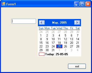
The first screenshot shows the screen with the date time picker.
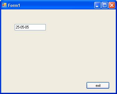
This screenshot shows the selected value in the textbox and the date time picker is hidden.
DateTimepicker
This control allows the user to select dates and times. Some of the important property of this class is given as below:
|
Property/evnets |
Description |
|
MaxDateTime |
Sets the maximum date value of the date time picker control |
|
MinDateTime |
Sets the minimum date value of the date time picker control |
|
Format |
Gets/Sets the format of the date and time |
|
MaxDate |
Gets/Sets the maximum selectable date and time |
|
MinDate |
Gets/Sets the minimum selectable date and time |
|
Value |
Gets/Sets the date and time value |
|
Closeup |
When the drop-down calendar disappears |
|
DropDown |
When the drop down calendar appears |
|
FormatChanged |
When the format property value changes |
|
ValueChanged |
When the value property changes |
The Windows Form’s DateTimePicker control allows the user to select a single item from a list of dates or times. When used to represent a date, it appears in two parts: a drop-down list with a date represented in text, and a grid that appears when you click on the down-arrow next to the list. The grid looks like the MonthCalendar control, which can be used for selecting multiple dates.
An alternative to the grid, useful for editing times instead of dates, is the up and down buttons that appear when the ShowUpDown property is set to true. When the ShowCheckBox property is set to true, a check box is displayed next to the selected date in the control. When the check box is checked, the selected date-time value can be updated. When the check box is empty, the value appears unavailable.
The following example explains the use of the DateTimePicker and the DateTimePicker1.ValueChanged event.
-
To a new project add to the Form1 a DateTimPicker control from the toolbox.
-
Double click on the control to open the editor for the DateTimePicker1.ValueChanged event.
-
Add the codes given below:
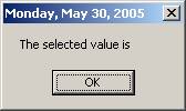
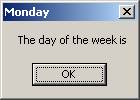
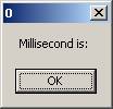
The output shows the various values that are extracted from the DateTimePicker. The following four screenshots show the sequence of events in executing the program.
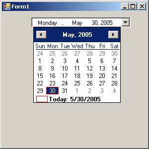
The values are shown as the caption.
{mospagebreak}
.
.
TreeView
Tree Views are used to display a hierarchy of nodes. Each node can have several child nodes. A typical example of this is the Widows Explorer. In the Windows Explorer you can see the tree view of the directory of the drives. You can either expand all the levels or collapse the nodes just by clicking on them. When they are expanded, you can see all their children. You can also choose the icon that will be displayed for the node. If the CheckBoxes property is set to true, then you can see that the tree view shows a check box. Nodes and SelectedNode are the two main properties of this control. The Node property contains the list of nodes in the tree view. SelectedNode property gets or sets the currently selected node. The nodes collection for a node holds the node’s child TreeNode objects. You can add or remove or clone a TreeNode. Tree views also support other properties for navigating through them, node by node. The properties like FirstNode, lastNode, NextNode, PreNode, NextVisibleNode, PreVisibleNode are used for this purpose.
ListView
In contrast to the TreeView the ListView is used to list the items in the right side of the windows and it serves as complimentary to the TreeView. ListViews can display their items in four different methods viz., View.largeIcon, View.SmallIcon, View.list, and View.Details.
ListItems is the property of the Listview, that contains the items displayed by the control. The SelectedItems property contains a collection of the items currently selected in the control. If the multi-select property is set to true, then the user can select multiple item.
Timer
Timer Class is a component that is used to create periodic Tick events that to execute code at specific interval. Some of the properties, methods and events are given below:
|
Property/Method/Event |
Description |
|
Enabled |
Gets/Sets whether the timer is running |
|
Interval |
Gets/Sets the time in milliseconds between timer ticks |
|
Start |
Starts the timer |
|
Stop |
Stops the timer |
|
Tick |
Occurs the timer interval has elapsed |
The timer can be started or stopped using the method Start() and Stop(). The Tick event handler will be used to add codes that we need to manipulate the activity of the timer. Each tick event takes place at a default time of 100 milliseconds. This default value can be changed. The following demo illustrates the usage of the timer component.
To a new project in Visual Basic
Express add a timer component to the Form1.
Add two buttons.
Add the following code to the page:
The output generated by the program is shown below:
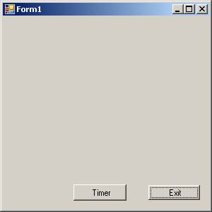
The startup screen is shown below:
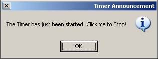
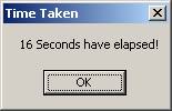
When you press the Timer button, it calls the TimerStartStop method defined which starts the timer and throws a message box which you see below
When you click Ok in the MessageBox, it stops the timer. While the timer is running the Tick event handler is incrementing the value of the variable t by 100 for every tick, which is the default time it takes between two successive Tick events. The timer event is stopped and the value of t is assigned to t2 after dividing it by 1000 to convert to seconds. This value is now displayed using the last MessageBox.
{mospagebreak}
.
.
TrackBar
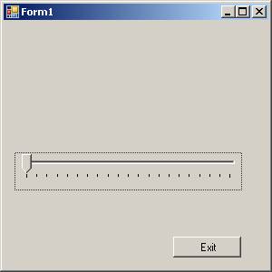
Trackbars are very much like scroll bars but the difference is in the appearance. Track bars look more like controls you might see on the stereos that control volume. You can configure the track bars range with minimum and maximum properties. You can also specify how much the value property should be incremented when clicks occur to the sides of the slider by means of the LargeChange property. The SmallChange property is the value changes that occur when the slider is manipulated by the user. A track bar can be displayed both horizontally and vertically.
Let us now create a new project in Visual Basic Express.
Drag and drop a TrackBar control, a label and a Command button as shown in the following screenshot:
Now add the following lines of code to the Page:
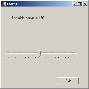
The output generated by the program is shown below:
ProgressBar
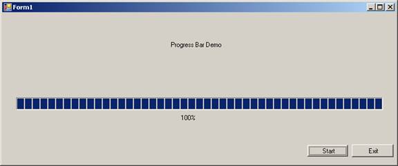
Progress bars are those simple controls that slow the progress of some operation by displaying rectangles in the horizontal bar. The main properties of a progress bar are value, minimum and maximum. You can use minimum and maximum properties to set the maximum and minimum values the progress bar can display. To change the display, you can write a code to set the value property. If the Maximum property is set to 100, the Minimum property is set to 10, and the value property is set to 60, then 60 rectangles will appear.
-
Create a new Visual Basic Project add a progress bar and two command buttons and two Labels.
-
Then add the following code to the form:
-
The output generated by the above program is given below:
HScrollBar and VScrollBar
A Scroll bar is a tool that allows the user to scroll through the windows. There are two types of scroll bars namely VScroll or HScroll. This usually appears automatically and disappears automatically if the content of the window reduces. You can also attach scrollbars manually by setting the property at design time or add it programmatically using the code. The sample code for attaching the ScrollBars for the TextBox1 is shown below
TextBox1.ScrollBars = ScrollBars.Both
The other possible values are ScrollBars.Vertical, ScrollBars.None and ScrollBars.Hornizontal
[catlist id=175].