.NET Common Windows Forms Controls
In this tutorial we will learn about Common Windows Forms Controls in Visual Basic .NET 2005. IN this part 1 of this article, We will be learning the controls like Control Hierarchy, Label, LinkLabel, TextBox, RichTextBox, PictureBox, GroupBox, Panel, Button, CheckBox , RadioButton, ListBox, CheckedListBox and ComboBox.
Control Hierarchy
The base class for all Windows controls is located in the System.Windows.Forms namespace. These controls are built into the .NET framework and form the basis for derived controls. These controls have a distinct hierarchy of their own. For example the hierarchy of the control rich text box is given below:
Object
MarshalByRefObject
Component
Control
TextBoxBase
RichTextBox
We shall take a quick look at some of the properties of the control:
|
Property |
Description |
|
AllowsDrop |
Value that decides to accept data dropped in to it |
|
Anchor |
Gets/Sets the value of edges of the control to be anchored |
|
BackColor |
Gets/sets value of the color of the Background |
|
CanFocus |
Returns a value which specifies id the control can receive focus |
|
DataBinding |
Gets the data bindings for the control |
|
Parent |
Gets/Sets the controls parent container |
|
Visible |
Gets/Sets the value determines the visibility of the control |
Some of the methods of the control are listed below:
|
Method |
Description |
|
BringToFront |
Brings the control to the front of the stacking |
|
Contains |
Retrieves a value specifying if the control is a child of this control |
|
Dispose |
Releases the resources used by the control |
|
GetType |
Gets the type of the control |
|
Hide |
Hides the control |
|
Invalidate |
Invalidates a part of the control and sends a paint message to the control |
|
DoDragDrop |
Starts a drag and drop operation |
Some of the events of the control are listed below:
|
BackgroundChanged |
When the value of the backColor property is changed |
|
Click |
When mouse is clicked on the control |
|
ControlAdded |
When a new control is added |
|
ControlRemoved |
When a control is removed |
|
SursorChanged |
When the cursor property value ischanged |
|
DragEnter |
When an object is dragged into the control’s bounds |
|
Enter |
When the control is entered |
|
GotFocus |
When the control receives focus |
|
Leave |
When the location property value is changed |
|
MouseWheel |
When the mouse wheel moves whild the control has focus |
|
VisibleChanged |
When the Visible property value is changed |
The above list is not exhaustive. However, a designer would find it profitable to get himself acquainted with the properties and methods of the different types of controls that he uses. Derived controls are customized controls that use the .NET framework controls as a base for building upon.
Label
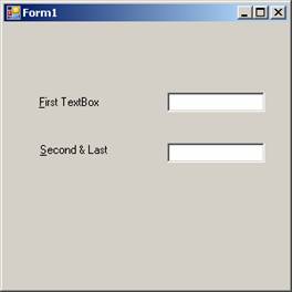
The Label control is used in a number of applications to indicate the nature of the input required or the name of a control or just to convey a message to the user. The autosize property of this control is true by default, but can be dynamically fixed. Since this control cannot receive focus, it can also be used to create access keys for other controls.
Let us see a demo for this activity:
-
Draw the label first, and then draw the other control. Other wise draw the controls in any order and set the System.Windows.Forms.Control.TabIndex property of the label to one less than the other control.
-
Set the label’s System.Windows.Forms.Label.UseMnemonic property to true.
-
Use an ampersand (&) in the label’s System.Windows.Forms.Label.Text property to assign the access key for the label. For more information, see Creating Access Keys for Windows Forms Controls.
-
The following code will accomplish the task. Press F5 and see the demo in action.
Click here for the Sample Code
The output of the above codes is shown in the screenshot pasted below:
Link Labels
This control is similar to the Label Control. In addition to all the properties, methods, and events of the Label control, the LinkLabel control has properties for hyperlinks and link colors. The LinkLabel.LinkArea property sets the area of the text that activates the link. The LinkLabel.LinkColor, LinkLabel.VisitedLinkColor, and LinkLabel.ActiveLinkColor properties set the colors of the link. The LinkLabel.LinkClicked event determines what happens when the link text is selected.
Link Labels are labels that support hyper links. Some of the important properties and events are given below:
|
Property/Event |
Description |
|
ActiveLinkColor |
Gets/Sets the color for an active link |
|
DisabledLinkColor |
Gets/sets the color for an inactive link |
|
LinkArea |
Gets/Sets the range of that will be treated as link |
|
LinkBehaviour |
Gets/Sets the value that represents the behavior of a link |
|
LinkColor |
Gets/Sets the color of the link |
|
LinkVisited |
Gets/Sets the value specifying if a link should be displayed as though it had been visited |
|
VisitedLinkColor |
Gets/Sets the color used for the links that have been visited |
The following code snippet demonstrates the usage of the link label.
Click here for the Sample Code
TextBox
The hierarchy of the control Text Box is given below:
Object
MarshalByRefObject
Component
Control
TextBoxBase
Text Box
This control is used mainly to collect user input of data and display text. The look and feel and the behavior can be controlled by manipulating the values of its properties, invoking some methods and also handling some of the events that this control is enabled to handle.
Some of the methods, properties and events of the text box are given below:
|
Property/Method/Event |
Description |
|
AutoSize |
Sets/Gets value specifying if the control can resize itself automatically. |
|
CanUndo |
Return a value specifying if the user can undo the previous operation |
|
Modified |
Indicates if the text box control ha been modified by the user since the control was created or its contents were lost |
|
Multiline |
Sets/Gets value to determine if this is a multi-line text box control |
|
SelectiedText |
Sets/Get value for the currently selected text in the control box |
|
SelectionLength |
Sets/Gets value of number of characters selected |
|
TextAlign |
Gets/Sets how the test is aligned in the text box |
|
WordWrap |
Indicates if a multiline text box control automatically wraps the words |
|
AppendText |
Append textx to the current text in the text box |
|
Clear |
Clears all the text in the text box |
|
Copy |
Copies the selected text to the clipboard |
|
Cut |
Copies the selected text to the clip board and clears the text box |
|
Select |
Selects the text in the text box |
|
Undo |
Undoes the last edit operation in the text box |
|
AutoSizeChanged |
When the value of the autosizeproperty is changed |
|
Click |
When the text box is clicked |
|
ReadonlyChanged |
When the value of the readOnly property changed |
{mospagebreak}
RichTextBox
Rich Text Box control is used for displaying, entering and manipulating rich text with formatting. Rich text format (RTF) supports many formats. The following code sample shows the usage of Rich Text Boxes and how we can load TRF documents to them.
Click here for the Sample Code
We shall take a look at some of the methods, properties and events of RichTextBoxes:
|
Property/Method/Event |
Description |
|
DetectUrls |
Gets/Sets a value specifying if the rich text box should detect URLs when type into the RichTextBox Control |
|
Rtf |
Get/Sets the kind of scroll bars to display in the TichTextBox Control |
|
SelectedRtf |
Gets/Sets the currently selected rich text format formatted text in the control |
|
ZoomFactor |
Gets/Sets the current zoom level of the rich text box |
|
LoadFile |
Loads the contents of a file into the RichTextBox |
The events defined for this control are the same as those defined for the TextBox Control.
PictureBox
With the Windows Forms System.Windows.Forms.PictureBox control, you can load and display a picture on a form at design time by setting the System.Windows.Forms.PictureBox.Image property to a valid picture. Acceptable file types which can be any of the following:
|
Type |
File Extension |
|
Bitmap |
.bmp |
|
Icon |
.ico |
|
GIF |
.gif |
|
Metafile |
.wmf |
|
JPEG |
.jpg |
To display a picture at design time
1. Drag and drop a PictureBox control on a form from the ToolBox.
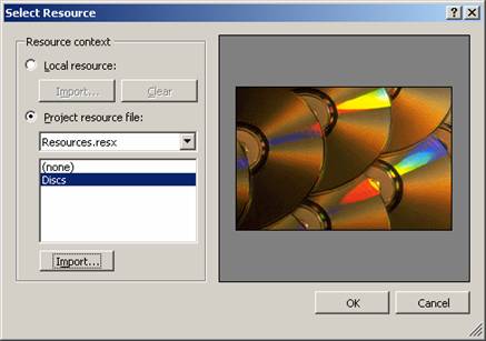
2. On the Properties window, select the Image property, then click the ellipsis button to display the Open dialog box.
3. If you are looking for a specific file type (for example, .gif files), select it in the Files of type box.
4. Select the file you want to display.
To clear the picture at design time
On the Properties window, select the Image property and right-click the small thumbnail image that appears to the left of the name of the image object. Choose Reset.
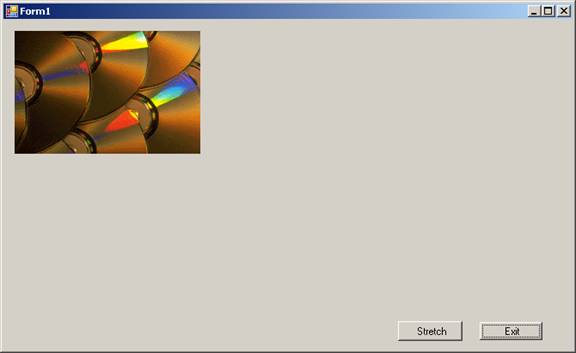
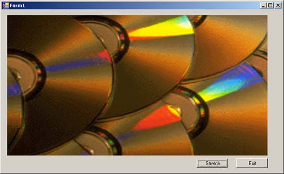
You can also add picture to the control at runtime and also change the properties at run time to perform activities like, stretching the image. The following lines of code demostrate the tasks like adding picture to the control at run time and also sets value for the PictureBox1.SizeMode as PictureBoxSizeMode.StretchImage.
Press F5 to execute and see the effect.
Click here for the Sample Code
The first screenshot shows the image added to the program at run time using bitmap Object.
The second screenshot shows the image added to the picture control to display using the method FromFile. The SizeMode of this control is set to stretch causing the image to be stretched.
GroupBox
Windows Forms GroupBox controls are used to provide an identifiable grouping for other controls. Typically, you use group boxes to subdivide a form by function. For example, you may have an order form that specifies mailing options such as which overnight carrier to use. Grouping all options in a group box gives the user a logical visual cue, and at design time all the controls can be moved easily — when you move the single System.Windows.Forms.GroupBox control, all its contained controls move, too. The group box’s caption is defined by the GroupBox.Text property.
Panel
All the features of the GroupBox are applicatble for the Panel control also. Additionally the Panel control can have a ScrollBar while the GroupBox displays the caption.
{mospagebreak}
Buttons
Buttons provide for the most common way of creating and handling events in the code. It exposes the common properties and the methods that help us use this control.
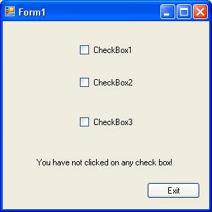
CheckBoxes
Check Boxes are controls that you click to select it and click it again to deselect it. This control can be ideally used when getting user input for answers of the type yes or no. Open a new project and on the Form1 you can add three check boxes, a label and a command button. Type the following codes in the code behind form:
Click here for the Sample Code
The following screenshots illustrate the performance of the program:
The screenshot shown below shows the initial screen. Note the label message that says that you have not clicked on any of the check box:
The following screenshot shows that the checkbox two is clicked:

The following screenshot shows that the checkbox is unchecked and label message has changed:

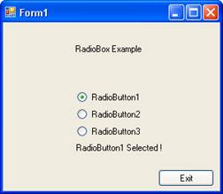
RadioButtons
Radio buttons are also checkboxes and the difference lies in the following areas:
1. They are round as against the checkboxes which are square
2. they are used mostly in groups
While checkboxes are used individually, the radiobuttons are use in groups. In case of the radiobuttons, if you check button 3 after clicking button1 the button1 is deselected automatically.
Let us see an illustration: The following code gives the demo for the radiobutton:
Click here for the Sample Code
The following screenshot shows the output:
ListBox
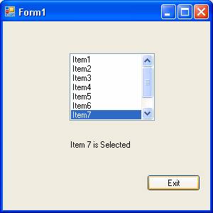
A List box is a useful tool that helps you to display a list of several items from which you can select one or more. A scrollbar is automatically added to the list box when the number of items in the list box increases.
1. To a new Form add a listbox from the toolbox.
2. Locate the property items in the property sheet.
3. Click on the collections on the other side.
4. A new dialog box is opened.
5. Add the items to this dialog box.
6. You must type one item per line.
7. On closing the dialog box the items added to the listbox are available.
8. Enter the following lines of code in the code.
Public Class Form1
Private Sub ListBox1_SelectedIndexChanged(ByVal sender As System.Object, ByVal e As System.EventArgs) Handles ListBox1.SelectedIndexChanged
Label1.Text = "Item " & ListBox1.SelectedIndex + 1 & " is Selected"
End Sub
End Class
Now if you execute the program by pressing F5, you will see the following output:
You can also add items to the listbox at runtime by using the following line of code:
Listbox1.Items.Add(“Item10”)
In the same way you can also remove the items from the the listbox:
Listbox1.Items.Remove(ListBox1.SelectedItem)
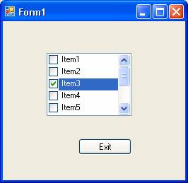
Checked listbox
Checked listbox is derived from standard listbox control. In this case you can see a check box at the side of the item list. To check an item, the user has to double-click a checkbox by default. But you can also do it by single click if you set the CheckOnClick property to true. A screenshot of the application executed is given below:
ComboBox
This control is a frequently used control. This control is made up of two parts. The top part is a text box that allows user to enter data. The other part is a list box that allows the user to select from the items listed. You can allow the user to type in an item or select an item from the list.[catlist id=175].