Common Controls and Handling Control Events
In this tutorial we will be learning how to use common control like Control Hierarchy, Label and LinkLabel, TextBox and RichTextBox, PictureBox, GroupBox and Panel, Button, CheckBox and RadioButton, ListBox, CheckedListBox and ComboBox, DomainUpDown and NumericUpDown, MonthCalendar and DateTimePicker, TreeView and ListView, Timer, TrackBar and ProgressBar, HScrollBar, VScrollBar, TabControl and Handling Control Events.
All controls are governed by the Control Class “System.Windows.Forms” Namespace. This class handles the entire basic window handle (HWND) functionality such as the creation and destruction of windows handles. When Control and Rich Control are integrated VB.NET provides for greater functionality.
A number of properties are shared by all controls in a class. Any change in such shared properties impacts on all controls in the class. Some of the shared properties are listed below.
DefaultBackColor: Read-only. Returns what the background color of the control would be if the background color were set explicityly
DefaultFont: Read-only. Returns what the font of the control would be if the font were set explicitly
DefaultForeColor: Read-only. Returns what the foreground color of the control would be if the fore ground color is changed.
Public Shared Properties
Public shared properties are distinct from properties that are shared by controls of a class in that the value of the property is not shared across the controls in a class. Any change in the property of a control does not result in a change in the properties of the controls in the class. Even when two instances of an object are created, each can have a distinct value assigned to a property. Examples of public instance properties are listed below for your understanding.
|
AccessibilityObject
|
Specified the AccessibleObject assigned to the control.
|
|
BackColor
|
Specifies the background color
|
|
Cursor
|
Specifies the cursor that is displayed when the mouse pointer moves over the control
|
|
Focused
|
Read-only. Returns whether the control currently as the input focus.
|
|
Size
|
Specifies the size of the control
|
|
Anchor
|
Specifies which edges of the control are bound to the edges of its container
|
|
Dock
|
Specifies to which edge of the container the control is docked. When specified, the resizing of the control is handled automatically. Controls that are “dockable” require code analyzing window movements coupled with the setting of this property
|
|
Font
|
Specifies the current font of the control
|
|
Location
|
Specifies the coordinates of the upper-left corner of the control relative to the upper-left corner of the controls container
|
|
Name
|
Specifies the name of the control. This value is typically used to refer to the control in code
|
|
Size
|
Specifies the height and width of the full control
|
|
TabIndex
|
Specifies this control’s place in the tab order for all controls within the same container
|
|
TabStop
|
Specifies whether the control can receive focus via the tab key
|
|
Visible
|
Specifies whether the control is visible
|
|
Enabled
|
Specifies whether the control is enabled. This also covers items such as receiving focus
|
Configuring the order of tabs
A user is required to move across a form in a prescribed order. The tab order of the control determines the way in which the cursor moves in the form and takes the user through the various options created for his use. This is a very important property for the application designer as it determines the sequence of user input if any.
Click on the control in the form and edit the TabIndex property and change its value. The value for this property is given in integers. This will be enabled only if the TabStop Property is set to true. Let us see an example for this feature.
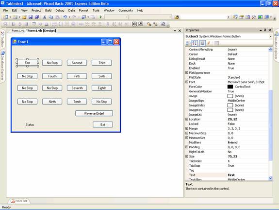
- Create a new project in the visual Studio IDE and add a form.
- Drag and add 18 Command Buttons to this form and arrange them in a matrix.
- Pick any 6 of them and select them.
- Set the property enabled to false.
- This can also be done at runtime as shown in the example.
- Position two buttons separately as shown in the from.
- You can also add two labels one at the top and the other at the bottom.
- For each of the remaining Buttons do the following changes:
- From the first button on the top left change their name in order and give them a new name (First, Second … Tenth)
- You will find that the TabIndex value would have already been set as per the order of their placement in the form.
- Change their values so that the label named first will have the value 1 and the label that has the name Tenth will have a value 10.
At the bottom of the form you will have one label control and two command buttons. Set the name value for the label as null and that of the first command button to “Reverse Order!”. Let the name of the second command button be “Exit”. Now your form will look like the screenshot given below.
You have to add the following lines of code to the project:
Click here for Sample Source Code
Execute the project by pressing F5. This example illustrates the purpose of the properties and also the method used to assign the properties at run time. Please note that the property TabStop is not available to all properties. For example the controls like Label and LinkLabel do not expose this property.
{mospagebreak}
Handling Control Events
Controls are used as a primary medium of handling events. Rich set of events are specified for controls and their nature can be easily understood by reading their names. For example OnClick, MouseEnter, MouseLeave etc. describe the nature of the event they handle. Some of the events and their descriptions are given below:
|
Event Name
|
Description
|
|
BackColorChanged
|
Occurs when the BackClolor property of the control is changed
|
|
BindingContextChanged
|
Occurs when the BindingContext property of the control changes
|
|
ChangeUICues
|
Occurs when focus or keyboard cues changes
|
|
ContextMenuChanged
|
Occurs when the Contextmenu Property of the control is changed
|
|
KeyUp
|
Occurs when a key is released while the control has focus
|
|
Move
|
Occurs when the control is moved
|
|
Resize
|
Occurs when the control is resized
|
|
Paint
|
Occurs when the control is drawn or redrawn
|
|
LocationChanged
|
Occurs when the location property of the control changes
|
|
Validating
|
Occurs when the visible property of the control changes
|
All controls have been declared with the functionalities built into them and therefore are capable of executing the function when the user calls the event. This process is enabled by using the term “Handles”. The program that is executed will look like the one below.
Private Sub Button1_Click(ByVal sender As System.Object, ByVal e As System.EventArgs) Handles Button1.Click
————
————
End Sub
The event handler takes two parameters in the above instance. The first is the sender as System.Object and the other is the valued ‘e’ as System.EventArgs. The Sender defines the object that has raised the event and the EventArg contains all the event specific data that the event sender passes.
There are other types of arguments that are accepted, such as FileSystemEventAtrgs, ImageClickEventArgs, KeyEventArgs and CommandEventArgs. Using the SenderObject could be particularly useful if a any action from out of a set of grouped actions is to be performed. Let us look at an example of this.
Start a new Visual Basic Windows Application Project in the Visual Studio IDE.
Add seven buttons and four labels and rename the buttons as shown as shown in the following screenshot.
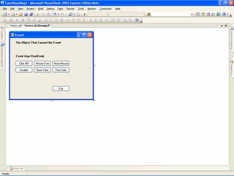
Two labels label3 and label4 are not visible as the text is set to null. Now add the code as given below:
Click here for Sample Source Code
Here, we have used a CommonHandler that does some action based on the output of the various events. This is a simple code that changes the text of the labels. You can also write complex codes using loops that perform some action based on the event of the object that has sent the event. This facility is very useful in solving complex problems with simple solutions quickly.
In the next chapter we will learn about Common Dialog Boxes and Creating a Custom Dialog Box in Visual Studio .NET 2005 using Visual Basic.NET 2005.
[catlist id=175].